smiit
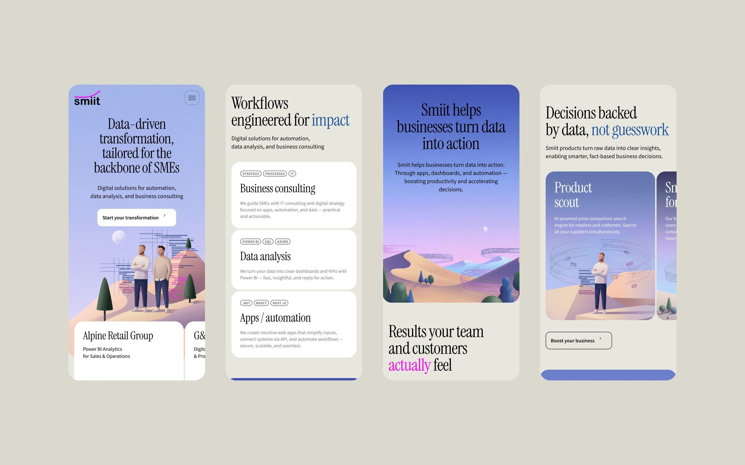
A home page for smiit, a German company that helps small and mid-sized businesses work with their data: consulting, analytics, automation and its own SaaS products. Structure, copy, design, an animated hero and the mobile version.
Project details
Services
UX/UI design · Page structure & copy · Illustration & motion · UI kit
Credit
Elma: Andrey Zhikalov
Engagement
smiit is a German company that helps small and mid-sized businesses turn their data into decisions: consulting, analytics, automation and its own SaaS products. It needed a home page that explains this range clearly and feels warmer and more memorable than a typical tech-services site.
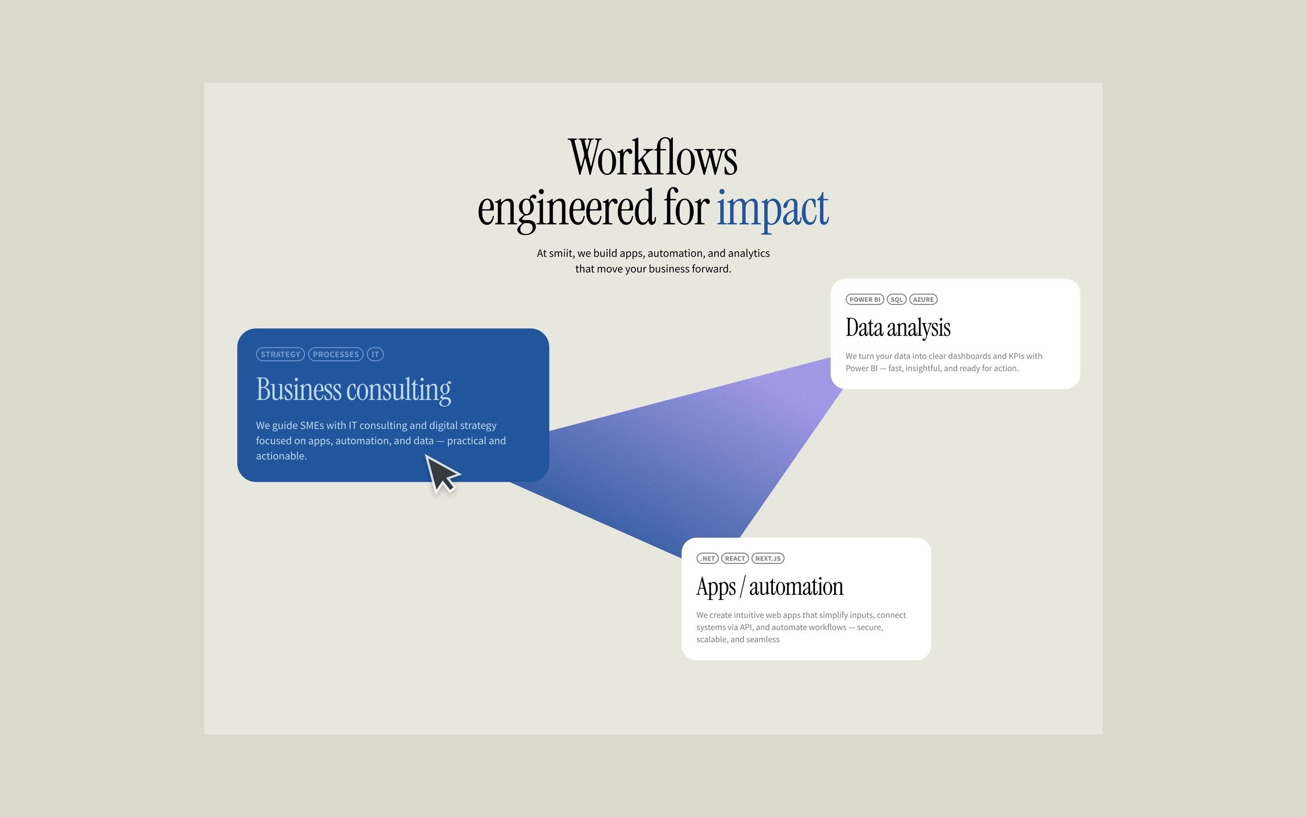
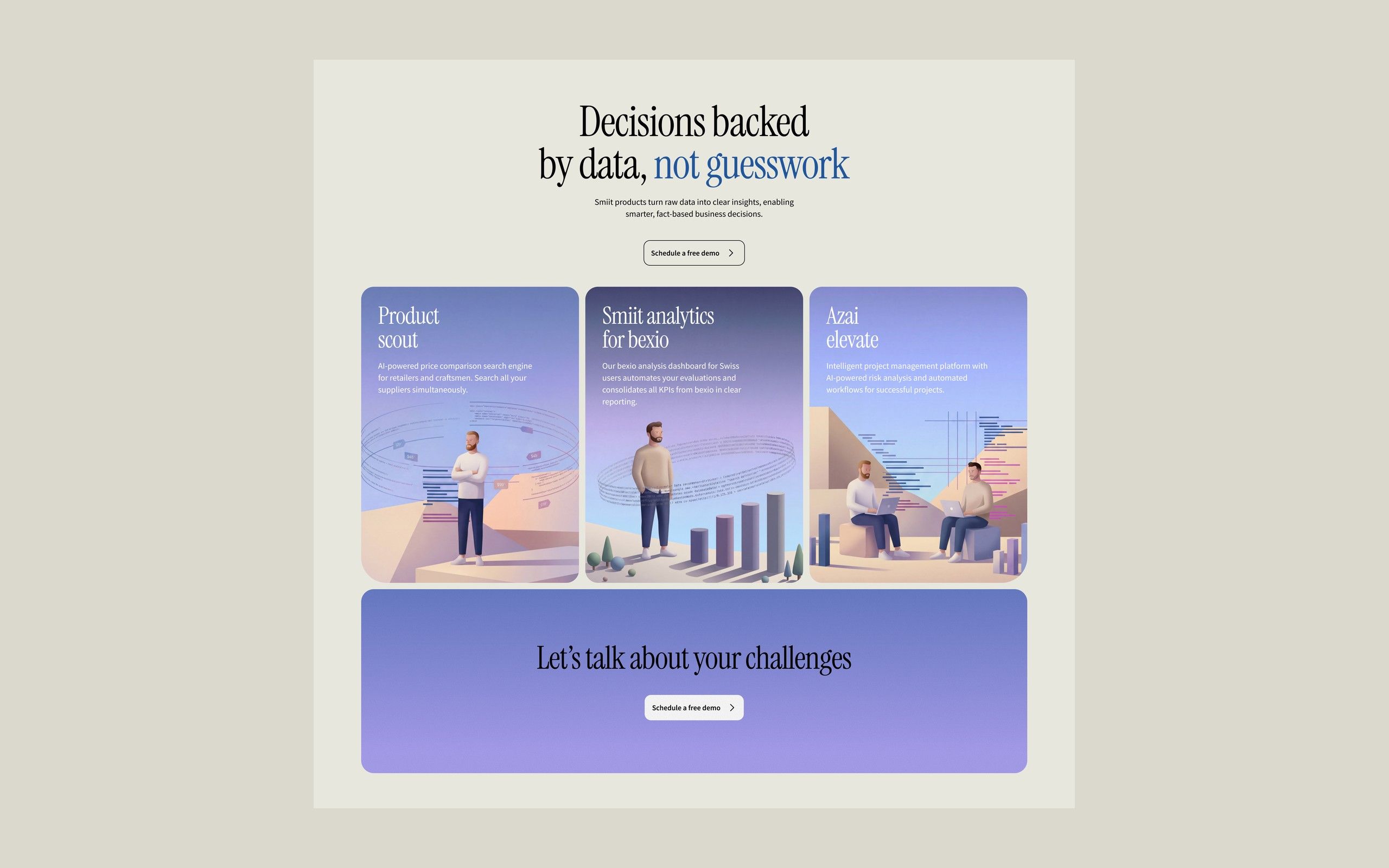
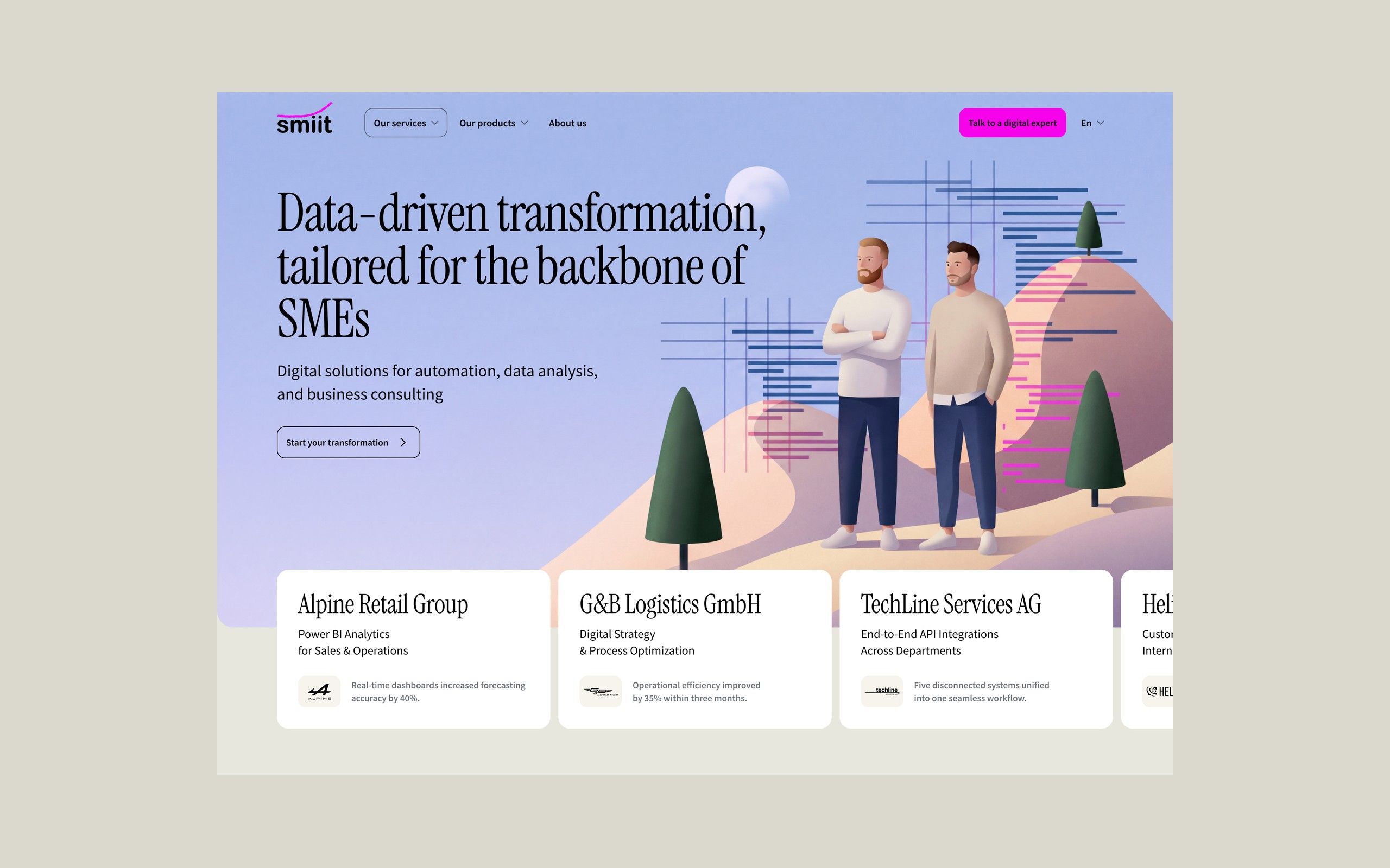
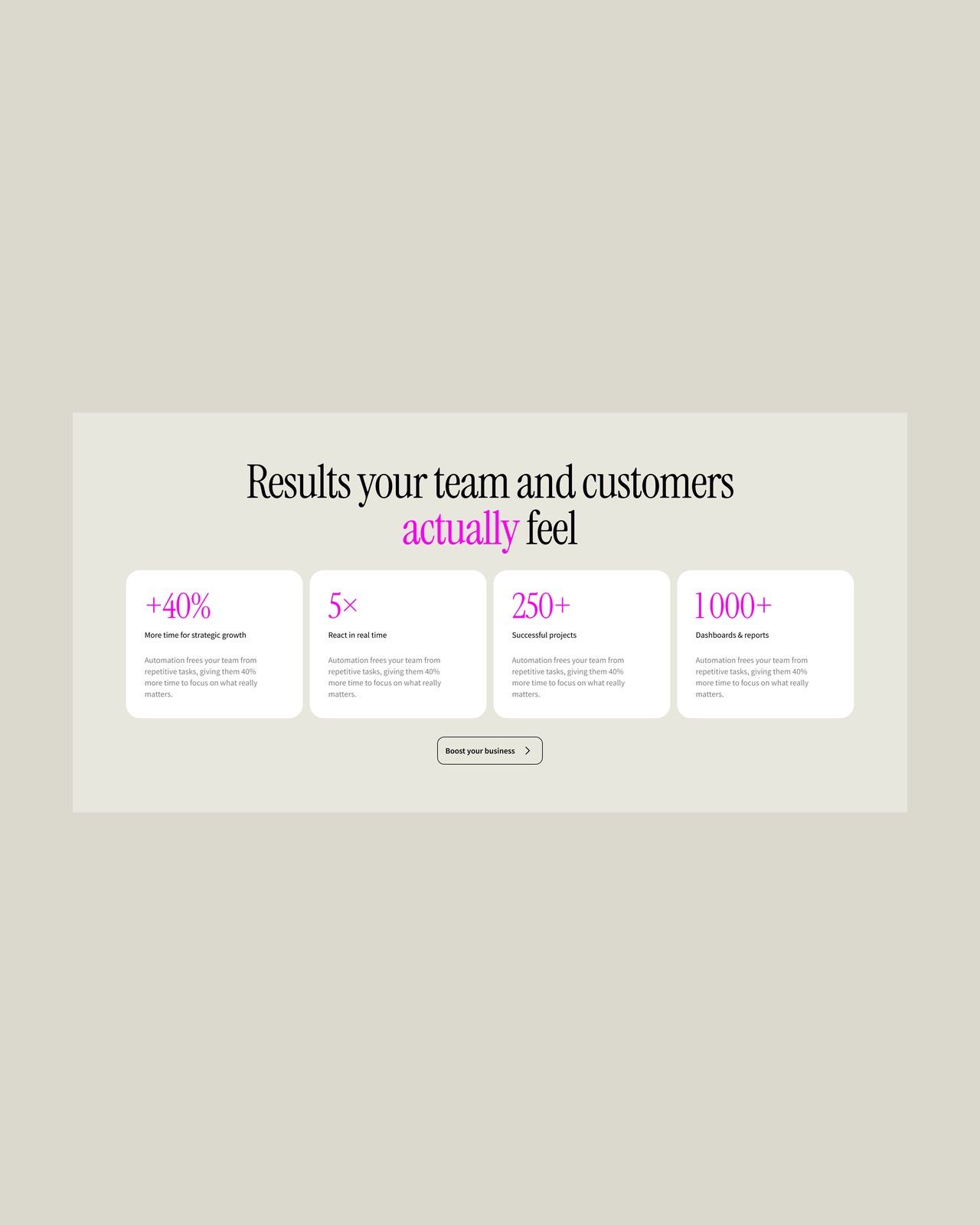
We rebuilt the page around one idea: data-driven change made for small and mid-sized businesses. The first screen states the offer and leads straight into short client cases, so the services are shown through results rather than abstract descriptions. Then come the services as one connected system, the benefits for clients, the products, and a closing invitation to discuss the visitor's own tasks. Instead of full-screen video, each section has its own illustration, and the one on the first screen is animated.
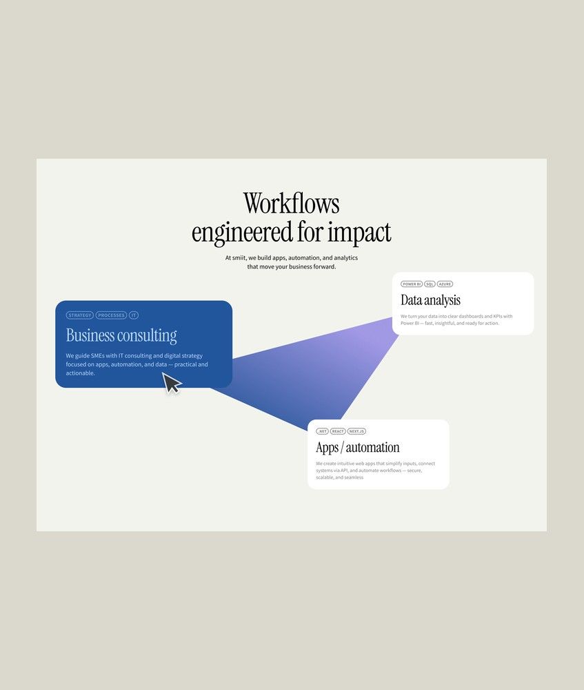
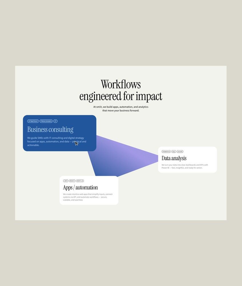
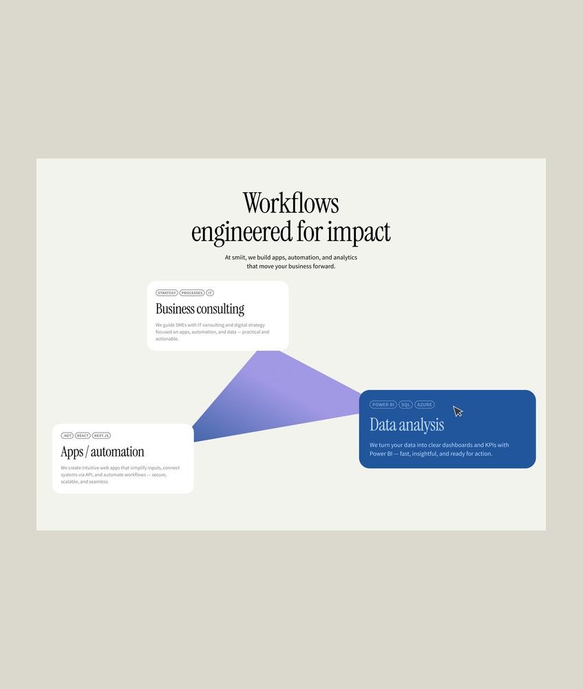
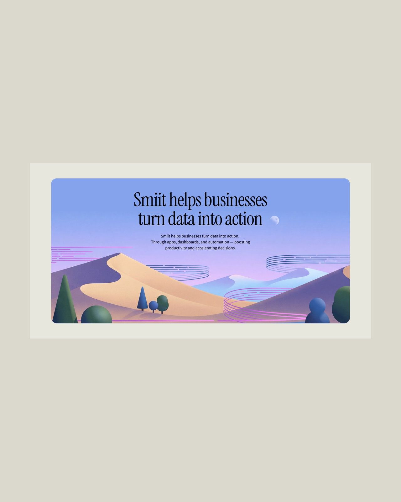
The result is a calm, light page on a warm sand background, with the brand pink and blue used only as accents and the contact button always in view. The service cards respond to the cursor. We delivered the desktop and mobile versions, the animation and a UI kit with element states; the smiit team is now building the site.